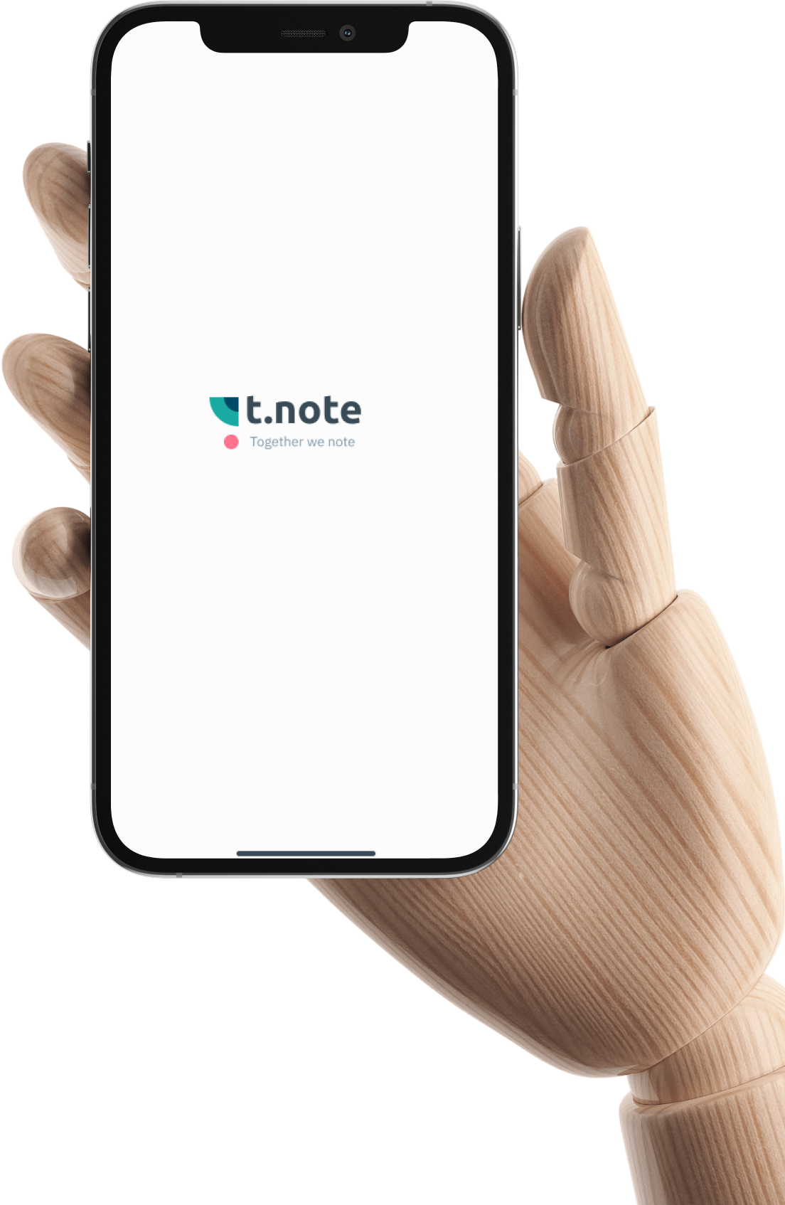
Mobile Application Design
Notes
Application
for iOS
Competitors analysis
User flow
Wireframing
UI concept design
Final UI design

The main goal of the project - to create mobile application design for iOS based on brief technical assignment.
competitors analysis
Competitors UX and UI analysis
Before designing it is a really necessary step to carry out a research of all the decisions and features which already exist on the market. The analysis of the main parts and features of 6+ main competitors had been done, in accordance with analysis conclusions the decisions had been made
Start (onboarding)
conclusion 1
Starting part usually consists of:
- start screen ( with logo and short description)
- quick tour how to use it
- logIn screen (or creating an account screen)
decision 1
Use the best practices:
- tell the user what is t.note about (onboarding screens)
start screen (with logo and short description) - quick tour for the first launch
- use the most popular socials for logging in)
Sharing
conclusion 2
Possible functionality:
- ability to share the note via messengers
- ability to give permission for editing
- make a note visible for contacts
decision 2
It will be our competitive advantage, because nobody
on the market suggest that functionality:
- ability to share the note via messengers
- allow comments
- make a note visible for contacts
- screen for shared notes timeline
- ability to share note’s reminders
UI Design
conclusion 4
Almost all reviewed applications have:
- vector illustrations
- one or few accent colors
- icons set
- sans-serif fonts
(but some applications still use serif fonts, imitating
the classic text editors familiar to the user)
decision 4
We will use:
- vector illustrations
- grey pallet and 3-5 accent colors
- standard iOS icons set
- sans-serif font pair
Note creating
conclusion 3
Some apps has only text input, but the others provide maximum of functionality such as:
- text input and providing heading system, lists etc.
- adding photo (and other media)
- ability to draw a note or picture by hand
- audiomessages
- ability to scan documents
- sticky notes board
decision 1
Provide the user with maximum input functionality
Solution
MVP
There are three main functionality realized in the app.
The first two could be minimal valuable ones which would be able to compete on the market reviewed above
Create a public note which everyone can view and comment, add reminders and share it also
Create a your private note which nobody can view and save to your own timeline
Create a public note which everyone can view and comment, add reminders and share it also
Solution
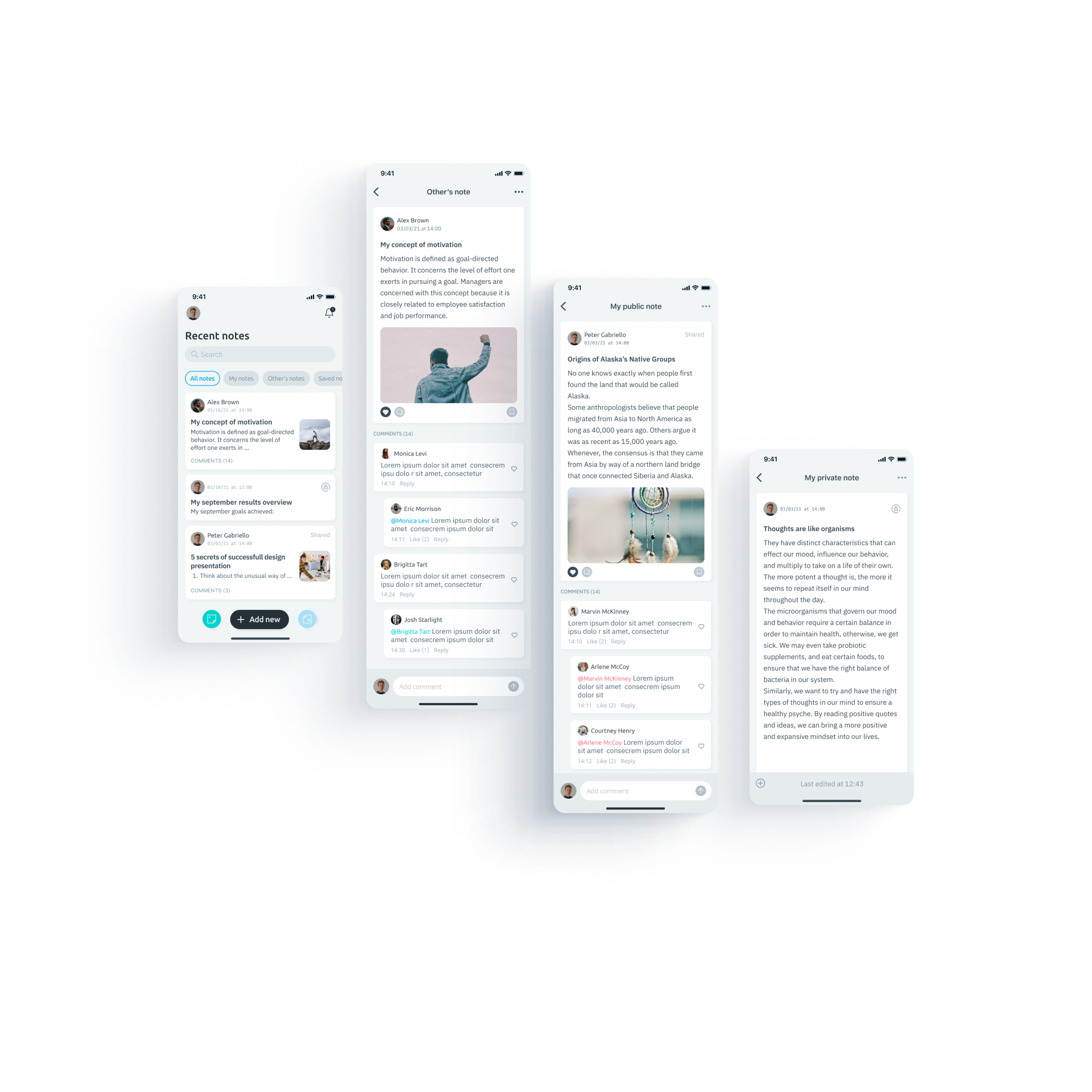
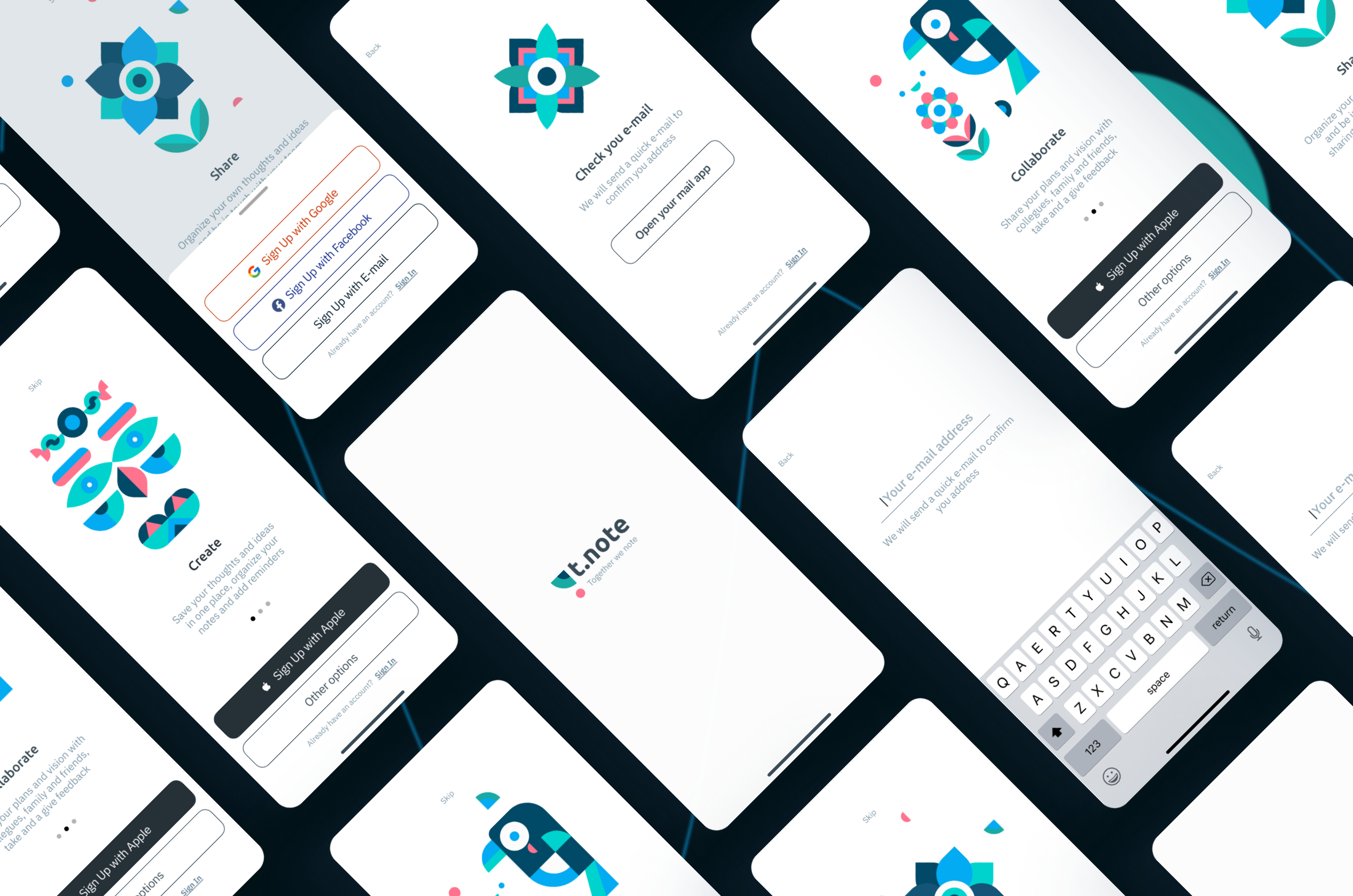
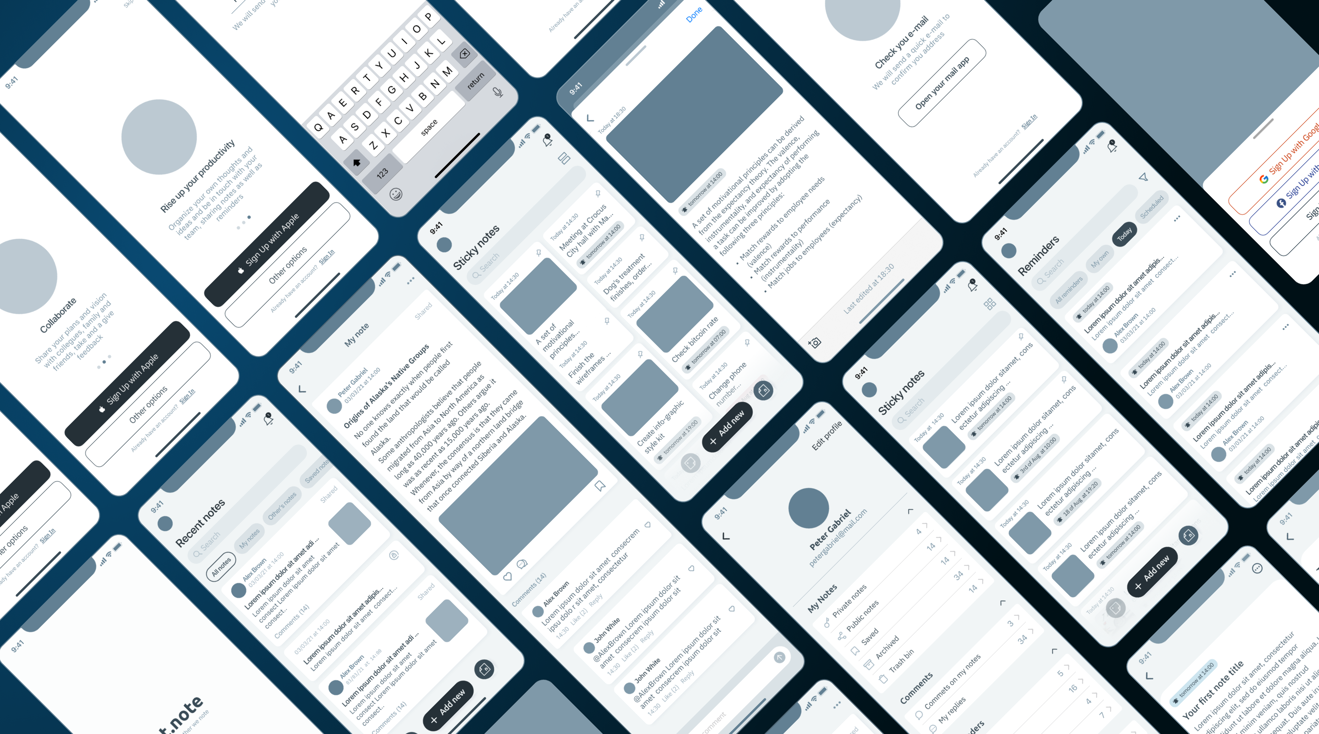
Onboarding screens
This is the first impression of the app. Three screens tell the user about the main features and suggest to log in or sign up.

main screens
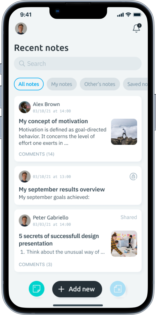
Home screen
Home screen provides access to the all the notes by categories as well as to the main functionality. Scrolling the timeline down user can go through all notes, open it and comment


main screens
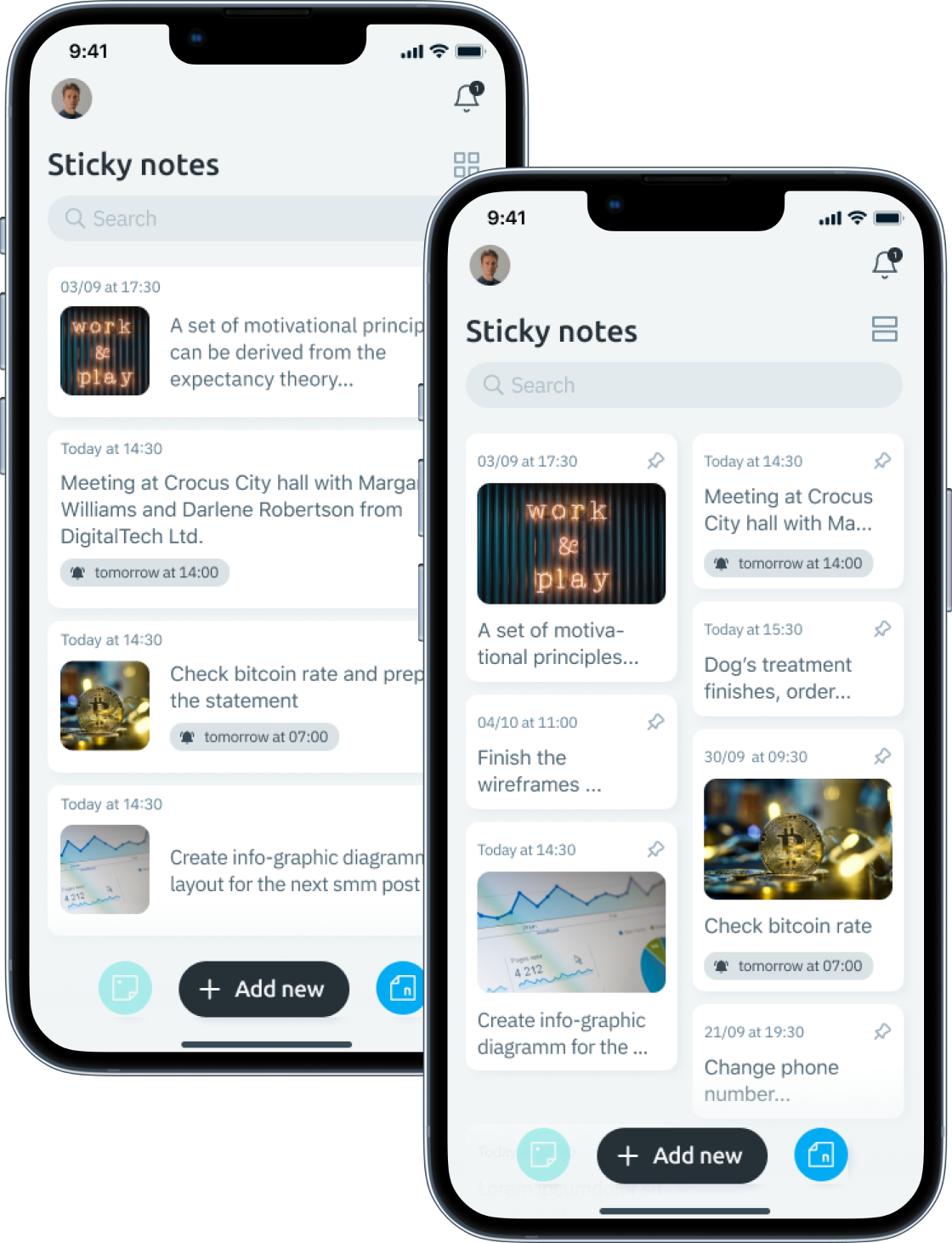
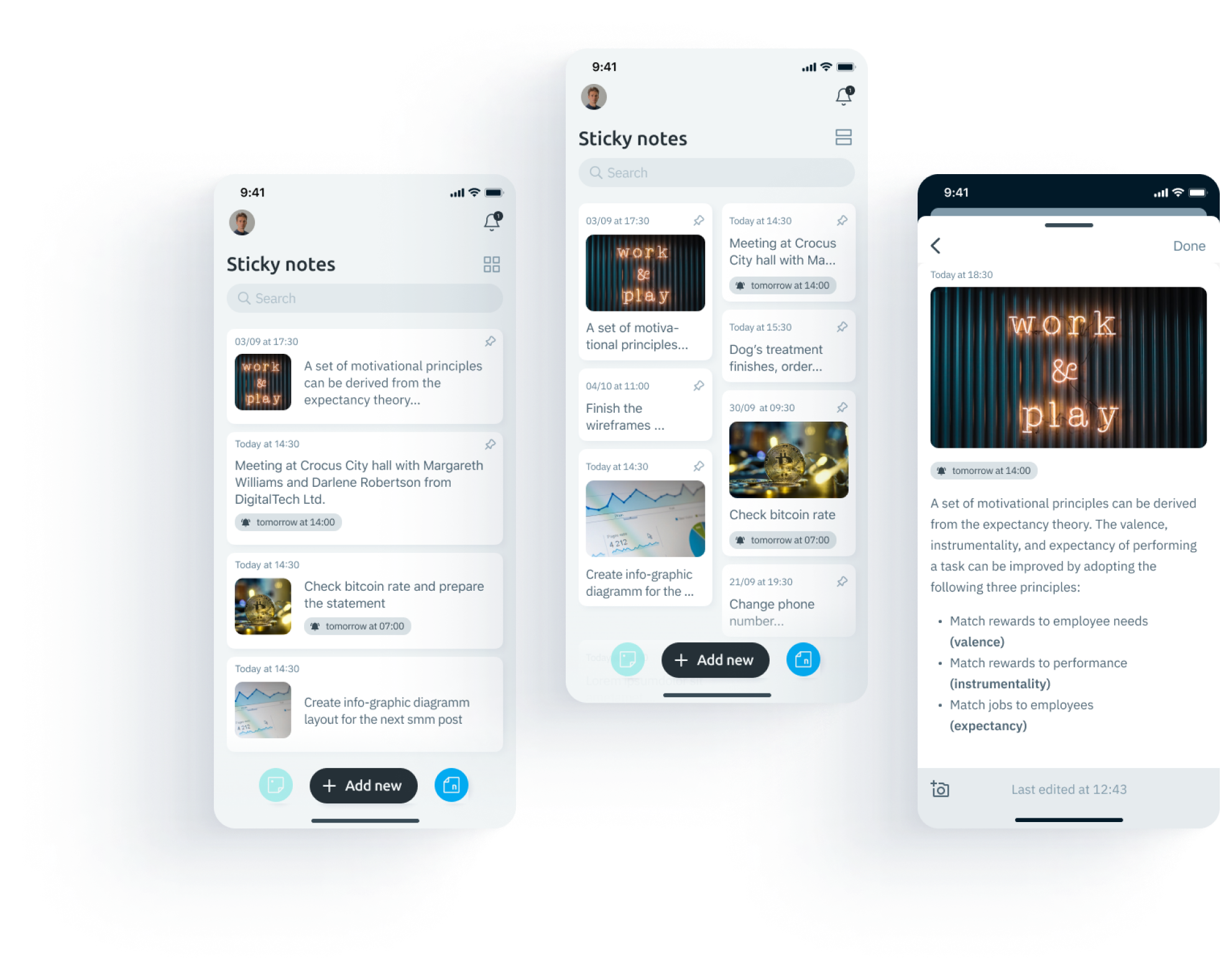
Sticky note board
Create a short note, pin it and never forget, also the reminder could be added. There two kind of screen view provided


main screens
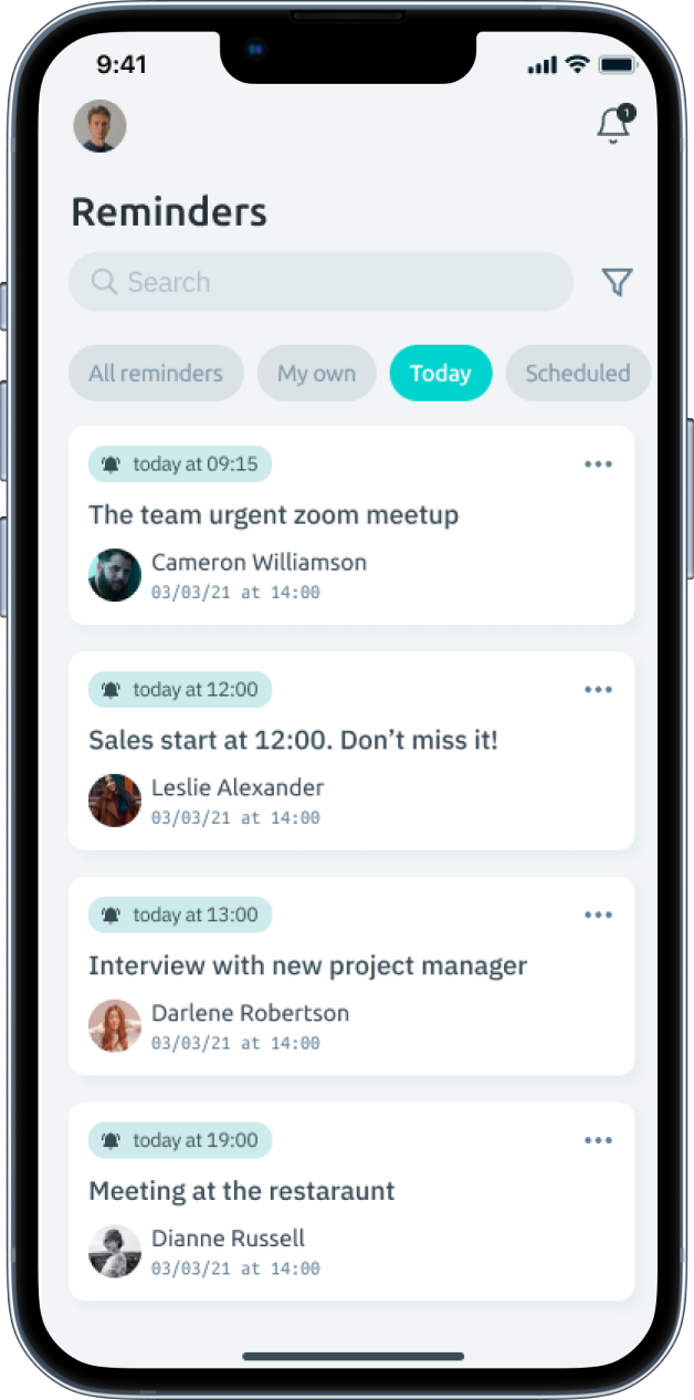
Reminder list
A reminder could be added to any note, including sticky note, also it could be shared and accepted/declined. This screen shows all the reminders and allows to manage it.

Solution
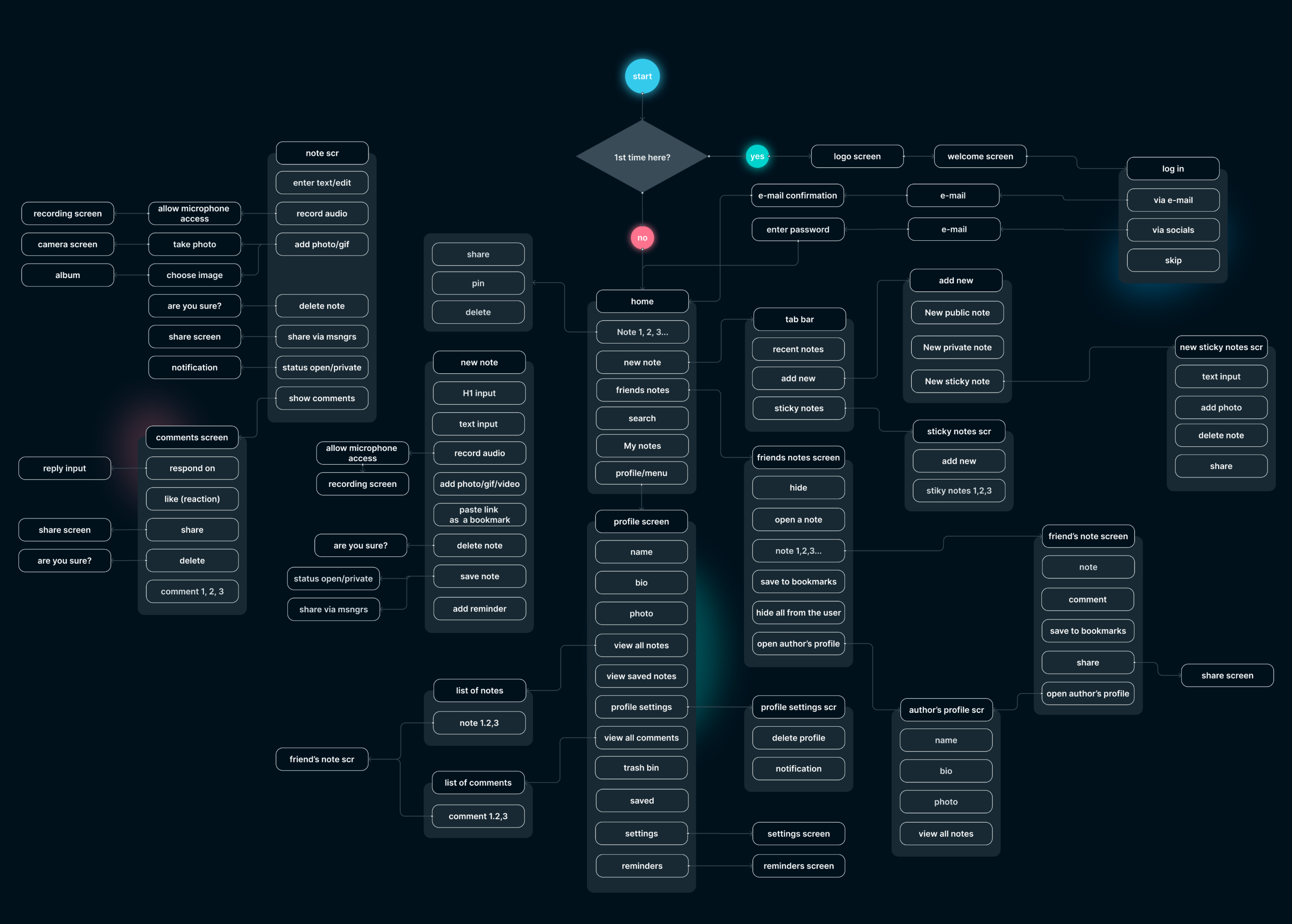
User flow
One of the most significant part of design process.
Before wireframing possible relations between screens should be clear. That’s why we start from user flow building
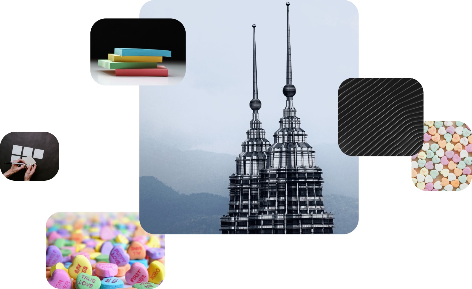
moodboard
UI concept
The style of the application should be business-oriented and do not distract from the intended user content, with simple and intuitive navigation created with bright accents.
According to color psychology statements black and deep-blue colors are the most suitable when we mean structure, accuracy, and any kind of organizational purpose.
Accent colors come from sticky notes familiar to everybody and also like multicolored candies, associated with buttons
solution
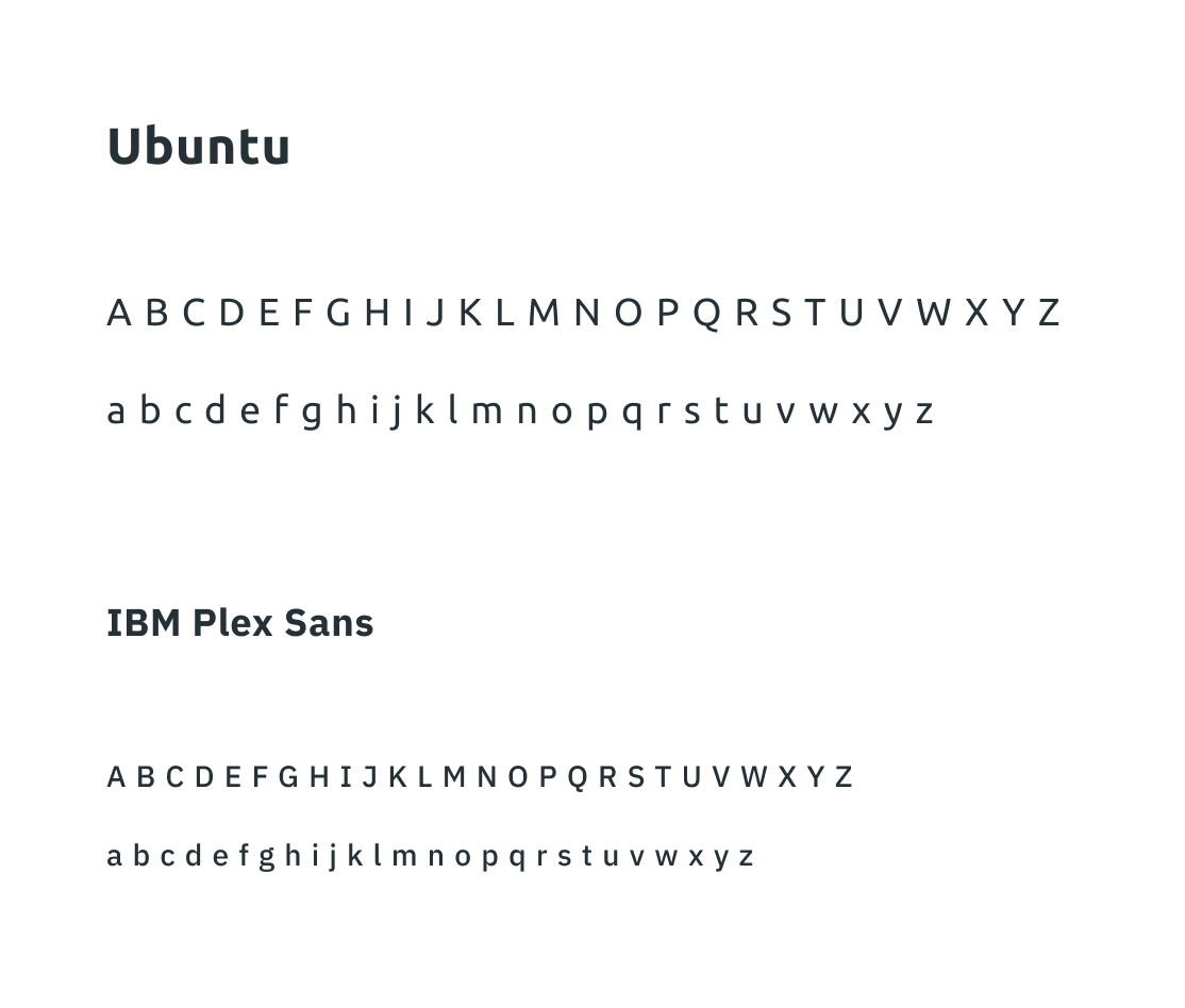
Color pallet & Typography

Solution
Wireframes
Wireframes serve multiple purposes by helping to:
Connect the app's information architecture to its visual design by showing paths between screens. Clarify consistent ways for displaying particular types of information on the user interface. Determine intended functionality in the interface.
Solution
Sticky notes
There are many mobile apps on the market with that kind of functionality realized. Many users know how to use it and expect it from an ideal note application
Solution
Public and private note
This is the main competitive advantage of the app, the ability to comment and view shared notes in a timeline.
There is also a private note

Thanks for your attention!